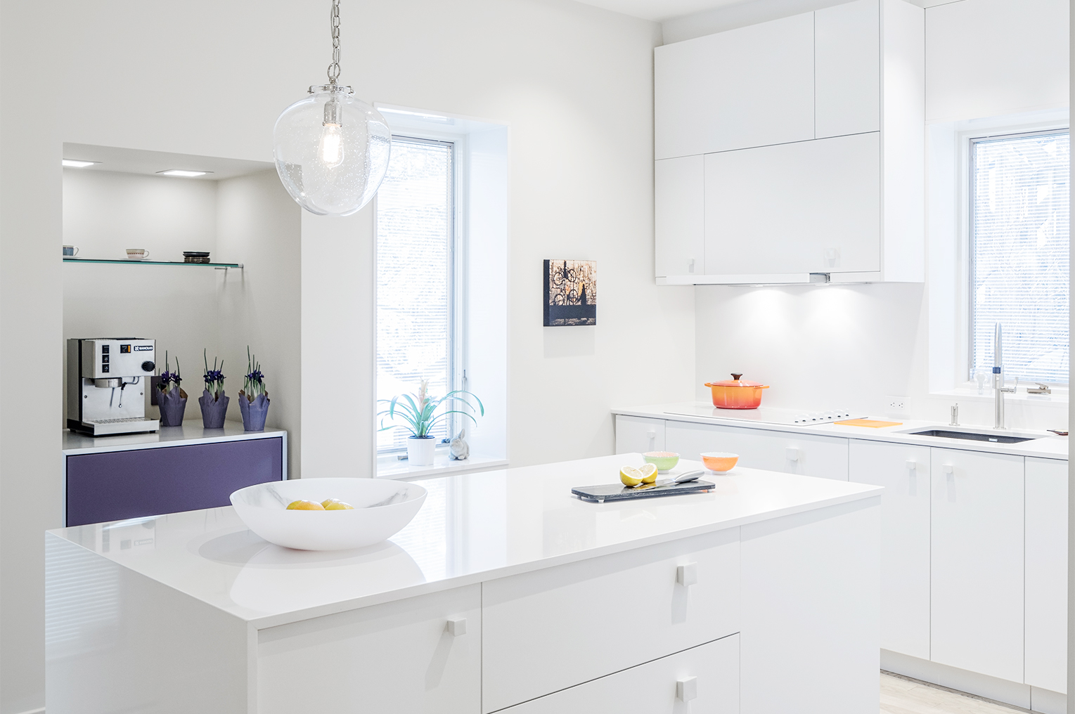
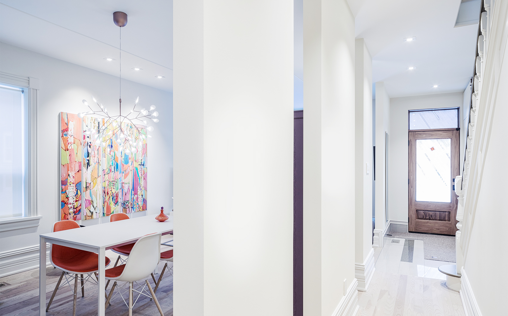
Why Custom Homes are Worth the Investment
Custom Home Builders Create Unique Luxury Homes Built to Your Specifications and Style
Every homeowner has likely given a fair amount of thought to updating their home, adding in luxurious features and beautiful fittings and finishes that stand the test of time.
But while renovations can go a long way towards creating your dream home, it’s tough to beat the opportunity offered by custom home construction.
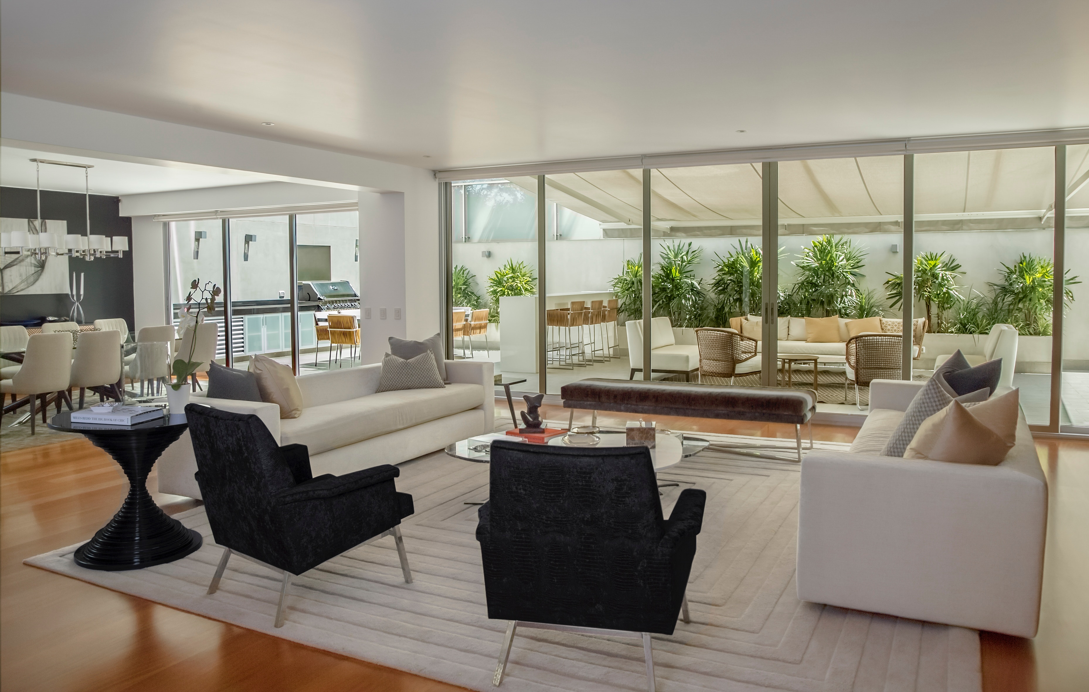
Built to your exact specifications and incorporating your unique style throughout, custom homes offer unmatched luxury, value, and comfort.
Custom home builders work with you to make your dream home a reality, whether you’re building on an empty lot or rebuilding on the foundations of existing property. These homes are a chance to get exactly what you want in a home that’s built to last, built around you and not as a one-size-fits-all option.
That said, a custom home is a significant investment, but there are plenty of reasons why that investment is worth it.
Luxury Homes that Reflect Your Lifestyle
Imagine living in a home that you helped design.
Designing your own home means saying goodbye to frustration about storage, shelving, door height, room size, and so much more.
It’s an opportunity to build a home around your needs and how you live your life.
You can customize your home to adapt to your preferences and changing family needs.
Add rooms and space you’ll need now or in the future, so you can use your home efficiently.
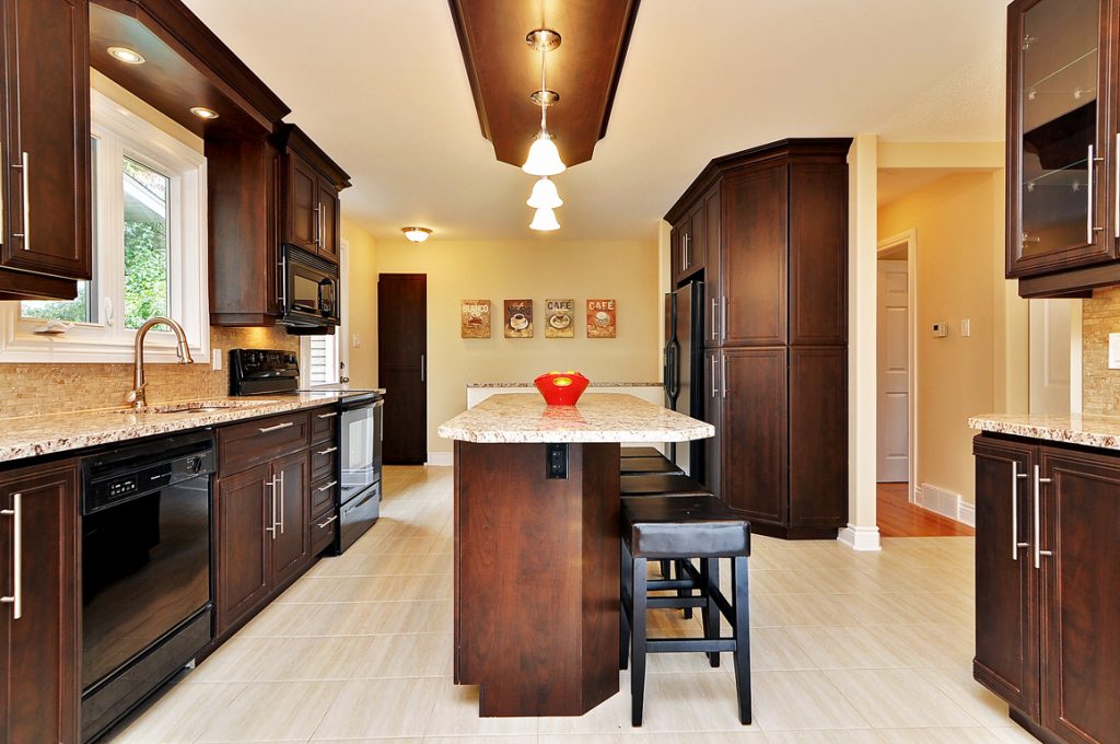
On average, new custom homes feature an additional 700 square feet of liveable space compared to homes built just 20 years ago. This means that you can enjoy the bigger kitchen you’ve been dreaming of, larger windows, a walk-in closet, and so much more.
Because these homes are designed from the ground-up to your specifications, the possibilities are endless. Working closely with custom home builders lets you create a unique design that accounts for all your needs and wants (within your budget, of course).
Or, if you’ve already designed your dream home with an architect, custom home builders will gladly work with these plans.
Location, Location, Location
This saying rings true with custom home construction.
Location is everything but buying a new home that offers a few upgrades over your existing location likely means changing neighbourhoods.
Adding space often means heading to younger neighbourhoods further from the heart of a town or city.
But custom home construction can occur wherever you choose, whether in your current home’s location or on a vacant lot in the countryside, suburbs, or in the heart of the city.
Aside from the feeling of accomplishment for being part of the entire design and construction process, you can truly enjoy your home as your own, with all the convenient and attractive design features you’ve been dreaming of.
Start-to-Finish Oversight
From the initial design to the finished product, customers are involved each step of the way for their custom home design and construction.
This client involvement means your vision guides the entire design and construction process. Furthermore, you can continue to make more choices along the way.
Say you saved money on lumber and plumbing. You can ask to put that money towards an extra closet in your bedroom and a granite counter top in your kitchen.
If you manage to save money throughout the project, you might be able to put that money towards further upgrades in your home without going over budget.
Or you can put that money toward another custom luxury feature. It’s up to you.
Whatever the savings, you can fine-tune your house to become the luxurious home of your dreams.
Full Home History and Lasting Value
Since you know the full story behind your custom home, you don’t have to worry about what might hinder renovations, updates, or upgrades in the future. You’ll know exactly what your home can and can’t handle, and you won’t be afraid to open up a wall since you already know your home’s bones.
Often during home renovations, homeowners come across obstacles and setbacks because they don’t know what’s behind the walls before tearing them down.
Old plumbing and wiring are common problems that need fixing, as are toxic building materials found in older homes. For example, nothing slows down a renovation quite like opening a wall and discovering asbestos. In this case, a special abatement team must come in to safely remove the asbestos. Not only does this take time, but it also increases your costs.
Plus, if you ever decide to sell (though let’s be honest, you won’t want to give up your unique home), this comprehensive record of your home’s history is a fantastic resource for real estate agents to work with.
Because your home won’t need any work done, it’s in excellent shape for resale, and
Experienced Custom Home Builders Bring Value
As a customer with the vision for your dream home, you benefit from working with an experienced construction company that specializes in custom and luxury homes.
Custom home builders take pride in their work and provide high-quality control over each step of the project.
Clients always come first for custom builders since it’s the client’s dream and vision that is driving the design.
They keep you informed and work within your budget.
Features and Materials that Add Value
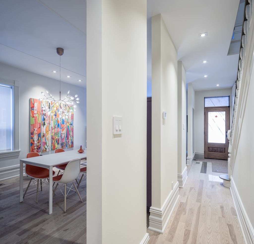
While it’s unlikely you’ll ever want to sell a custom-built home, there are several features you should consider including in your design that nonetheless add value on the market.
Many of these features are energy saving or energy efficient, helping reduce heating and cooling bills or eliminating drafts and ensuring optimal seals and insulation throughout.
What’s more, the custom, high-end nature of the home carries appeal, too.
For example, at Sunter Homes, we use high-quality materials that are accurately installed to minimize future maintenance needs. This means less work in the future and a home that doesn’t just look fantastic but stands the test of time, too.
You can also add innovative technology to make life that much easier. Home automation systems control everything hooked up in your home, such as lights, heating, cooling, security, and sound systems.
While it’s true that these unique home builds represent a significant financial investment, it’s an investment well worth it in the long run. Custom homes retain their value and are built to last you a lifetime. If you’re looking for an opportunity to create a truly unique home that reflects who you are, then working with the custom home builders at Sunter Homes is the perfect place to start.
Home Renovation Planning from Start to Finish
Expert Advice For Keeping Home Renovation Projects On-Track and Stress-Free
Home renovations are a big undertaking, whether it’s a smaller project or a larger makeover. With so many factors to consider, it’s important to plan things out ahead of time.
Managing expectations is integral to any good plan. It’s easy to get overwhelmed, especially when the unexpected rears its head. In our experience, one of the chief reasons why people hire renovation contractors is to remove stress.
The Sunter Homes team is always here to help you with every aspect of your renovation. From planning to construction, we’ve got plenty of experience bringing beautiful spaces to life.
As such, we’ve put together a few pieces of must-have advice and information to help you get a handle on any project.
What’s Your Vision?
Before any project can break ground, you’ve got to take a moment to establish what the project actually is. You’ve got some ideas, but are they concrete enough to invest your time and money in?
Start by conducting an inventory of the rooms in your home. From there, dream big! Create a list of features and rooms your dream home has. What do you want from your home? Compare both lists to see what gaps can be filled to meet your needs.
For example, say you want an extra living room in your home. Where is the best existing space for this? Is it on the main floor, in the basement, or can it be created in a loft?
Remember, at this point, you’re not imposing limits. Don’t think about the budget, don’t think about structure, and don’t think about what’s pragmatic. Focus on what you want and build a plan from there!
Expert Input
By this point, you’ve got a good sense of what you want out of your home.
Now is the perfect time to build out a plan with help from the experts!
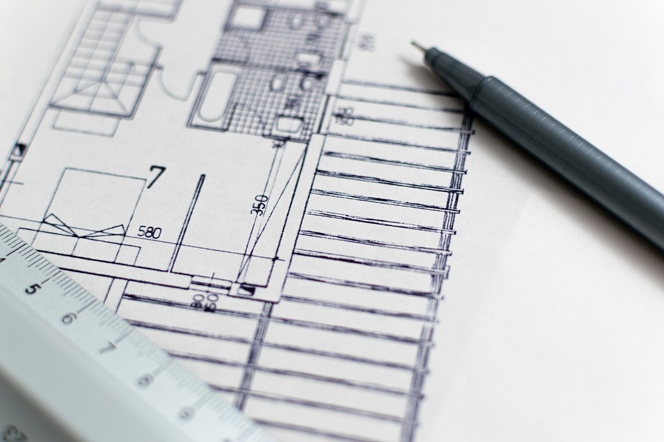
Professional home renovators offer expert advice to help you bring your vision into the real world. For example, here at Sunter Homes, we work with talented architects and designers to help translate your vision into an on-paper plan of action.
From there, we offer our advice on materials, timeline, and construction details. Your renovation contractor will advise you on what’s feasible, what’s within budget, and what can be done on a given timeline.
Design and Planning Considerations
Now you’re getting into the details!
By the time you’re consulting with renovation experts, you should be finalizing design and planning details. Here are a few things to keep in mind before you give your renovators the go-ahead to start:
Storage
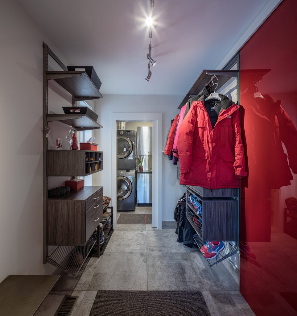
Storage space needs to straddle a fine line between convenience and practicality. It’s certainly tempting to tear down existing storage options and start fresh, but take the time to look at how you’re actually using that space.
If parts of it can be reused or updated, then there’s no sense scrapping things. You might be able to make a few simple updates to improve storage options!
Try rearranging drawers, shelves, closets, and other storage areas to free up storage space.
Maximizing Existing Space
Do you really need a home extension or addition?
There are always ways to maximize existing space. In some cases, it means rearranging a room’s layout and focus. In others, it could mean knocking down walls to create an open-concept space.
It might even be simpler design updates to make the most of an under-used room. Whatever the case, working with expert designers, architects, and renovators can help you look at your existing space in a new light.
High-Quality Features and Materials
For beautiful renovations that last, there’s no real alternative to high-quality materials and features. This way you can admire and enjoy your home renovations for many years to come.
High-quality materials, installed properly, will last a lifetime with minimal maintenance. You want a finished space that’ll look fantastic and stand the test of time, after all.
10 Renovations & Upgrades That Increase the Value of Your Home
Are you renovating ahead of selling your home? Even if you’re not thinking of moving immediately, some renovations can actually help increase the value of your home. It’s worth keeping these projects in mind to help you get a better price, but beware! Some of these renovations can improve your home so much you’ll never want to leave.
- Flooring – Hardwood floors are a classic, timeless look, and much more adaptable than carpeting. Homebuyers love hardwood floors, but heated subflooring and good tilework are also very popular.
- Hardware & Fixtures – Good hardware and good fixtures will never go out of style. Dependable, reliable details that add a touch of class can help boost your asking price.
- Bathrooms – A good bathroom, partial or full, can add value to your home. The last thing buyers want to deal with after buying a home is to invest in a bathroom. If you’re looking to sell, even a few simple updates to your home’s bathroom can make a difference. Never overlook the appeal of a walk-in shower!
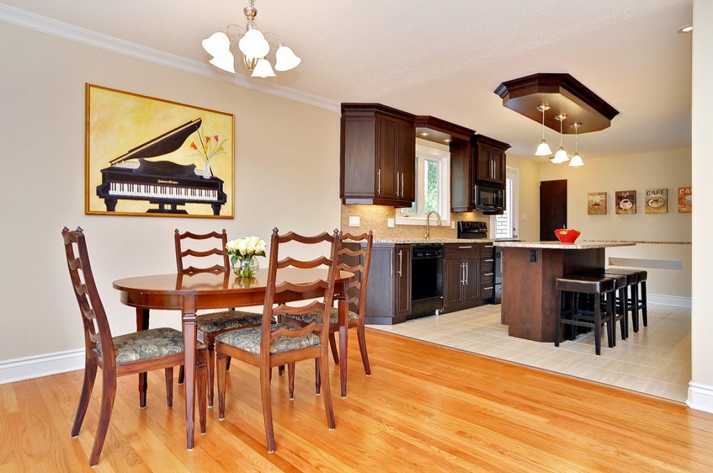
- Kitchen – Kitchens are the heart of a home. As such, it makes sense that families place such a high priority on a good kitchen. Good cabinets and a smart layout can help your home stand out, and fetch a higher asking price. Stainless steel appliances are a popular trend, too.
- Additional Space – Let’s face it, no one is ever going to say no to additional usable space!
- New Plumbing & HVAC Systems – Since buyers can’t see your plumbing and HVAC systems, these won’t add instant curb appeal to your home. However – they’re still selling points!
10 Things That Won't Add Value to Your Home
Of course, on the other hand, there are a few features that don’t inherently add value to your home:
- Solar Panels – Eco-friendly homes are attractive to home buyers, but you won’t recoup the costs of your solar panels.
- Wall-to-Wall Carpeting – Carpeting, no matter how new, is not usually a selling point in a home. You can almost see the disappointment on a buyer’s face when the home they’re viewing is fully carpeted.
- A Wine Cellar – While many wine lovers would be thrilled to have a wine cellar, it’s not for everyone.
- Loud Design Elements – Bold colours and tiles can scare off some buyers. If you’re planning to sell, keep these design elements as neutral as possible.
- Elaborate Landscaping – If the landscaping is too much work for a potential buyer to handle, they won’t be eager to buy. Keep landscaping attractive but low-maintenance. A good-sized backyard or front yard, if kept simple, can be a plus for families with young kids or green thumbs looking for a blank canvas.
- Swimming Pools – A swimming pool may add some value to your home, especially if most of your neighbours have pools, but you won’t recoup most of the costs when you sell.
- Bathroom Additions – While a renovated bathroom adds value to your home, you may not recoup all the costs of an additional bathroom.
- Ornate Lighting – A decorative light fixture can add character to a room. But if it isn’t energy efficient, home buyers might be turned off by it. When changing light fixtures, opt to include LED lighting for most if not all of your lights.
- Fussy Design Details – While exposed timber looks beautiful, it can be difficult to maintain, which could scare away some buyers. So when choosing design elements to increase your home’s value, keep the potential buyers in mind.
Getting Building Permits
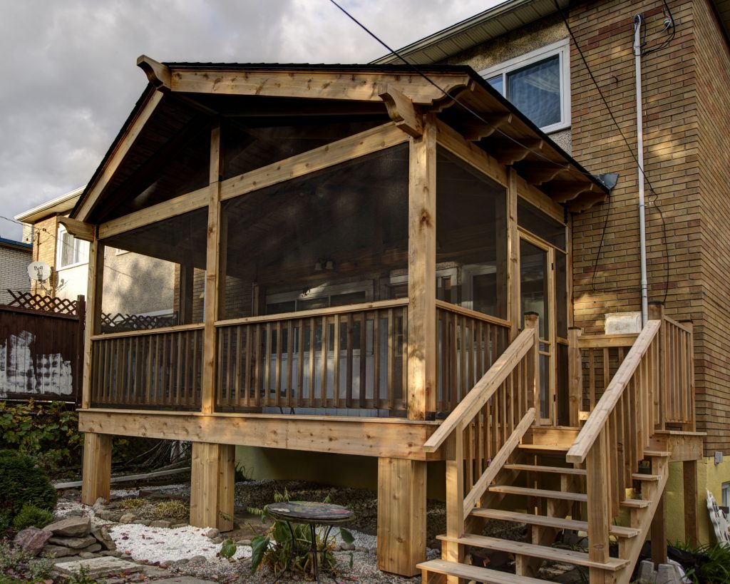
Some home renovations may need approval from your city or municipal council. Renovations that may need approval include:
- Additions
- Structural changes
- Decks
- Changes to the use of some rooms
Before you start, make sure your renovations meet local building bylaws and have approval from your city or municipality.
If you’re not sure you need a building permit, stop by your municipality’s offices or website to find building code regulations. The City of Ottawa has a convenient one-stop page that includes details on application fees and requirements.
We’re always available to help our clients navigate the building permit process.
Setting Realistic Timelines
As much as you’d like to have your renovations over and done within a short period of time, quality home renovations cannot happen overnight. So to avoid disappointment, be patient and realistic with your timelines.
Professional renovation experts will complete renovation projects following a sequence of work. Their sequence ensures efficiency and avoids more work (e.g. cleaning up paint off new flooring) later on.
Here is an example of a sequence of work from start to finish to give you an idea of why a contractor completes work in certain steps.
- Design: Plan the design and go over it with your contractors, including the tradespeople.
- Demo: Tear up flooring and tear down walls and cabinets (according to your plans).
- Rough In: Install new wall framing, electrical, gas, and plumbing.
- Walls and Ceilings: Install plasterboard and new ceilings (if needed).
- Doors and Windows: Install trim, skirting, and architraves.
- Cabinets: Install the carcasses, leaving the doors until later.
- Countertop, Sink and Tap: Since the countertop is cut to fit the sink, these three parts are installed together.
- Paint and Backsplash: Finish painting and install the backsplash.
- Flooring: Lay floor after cabinets and painting, but before installing the appliances.
- Appliances and Lighting: The electrician and plumber will install these.
- Cabinet Doors & Drawers: Hang the doors, add open shelves, and position the drawers.
And there you have it! Keep these tips in mind before you start any renovation project. When in doubt, don’t hesitate to reach out to the professionals for help. You’ll be able to create the new home you’ve been wishing for without any undue stress!
Make the Most of An Unfinished Basement
Basement Renovation Ideas to Help You Prepare for a New Home Theatre, Rec Room, or Basement Suite
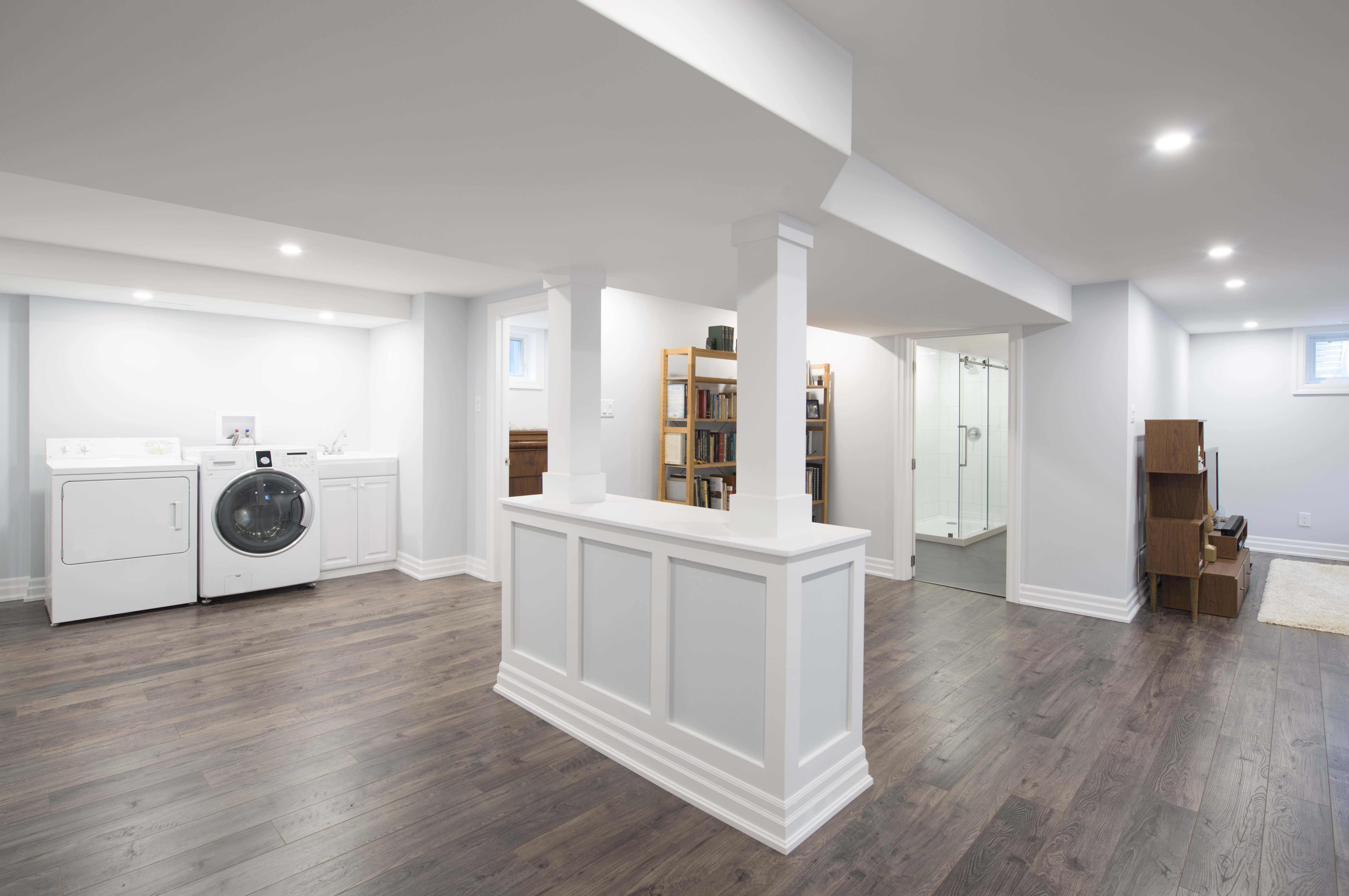
Do you have a dreary basement that you dread going down to? Are you frustrated by an unfinished basement? Basement renovations can solve these problems and put this often-overlooked space in your home to good use.
Whether you’re looking for a full renovation or simply need some finishing work done, this is a perfect opportunity to consider how your basement can augment your lifestyle or even provide an investment opportunity.
A finished basement, especially one with additional features, adds value to your home. But more importantly, it makes your home more enjoyable, providing extra living space to use for whatever you desire.
If you’re just starting to explore how you can transform your basement, or even if you’re ready to start work, we’ve put together a few reasons why basement renovations are a perfect way to complement your home and lifestyle. We’ve also got a few ideas that might inspire you to create something beautiful with our team of experts!
Why Basement Renovations are Worth It
Increase Your Living Space
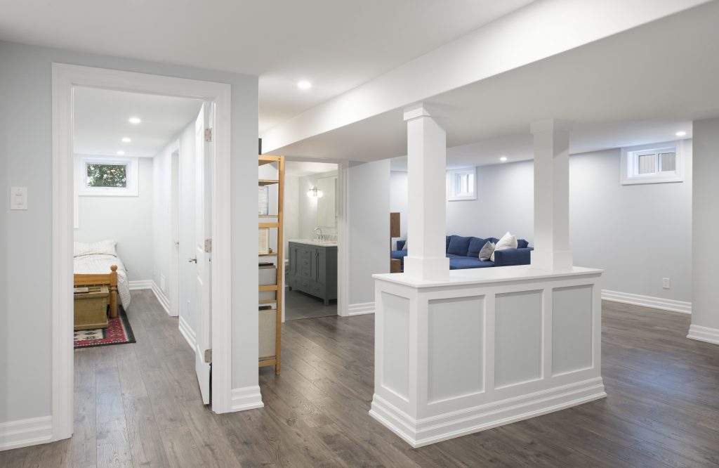
If your basement has become a storage space for the odds and ends you don’t really have room for, why not renovate? If you’ve already got a finished basement, a few modifications can quickly transform the space, adding extra square footage to your living space without the cost of an addition.
Furthermore, finishing a concrete-floor basement can make it feel less like unruly storage and more like a part of your home. Even if you don’t fully furnish or outfit your basement, finishing at least provides some cohesion and comfort.
Improve Your Quality of Life
It’s hard to measure quality of life as it depends so much on things that aren’t immediately quantifiable. But look at it this way: giving yourself another space to use and enjoy is certainly going to improve how you feel at the end of the day.
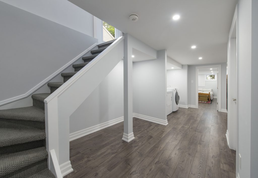
Imagine doing laundry and storing belongings in a beautifully finished basement. Imagine having a full basement guest suite for guests to stay in when they visit, or a spot to put a small weight rack and a treadmill.
It’s a tremendous benefit, and it’s possible with space you may already have.
Improve Air Quality
Basement renovations are a perfect opportunity to identify and take care of any moisture problems to prevent them from reoccurring.
Moisture often leads to mould and mildew growth in unfinished basements. Mould is toxic to breathe in and can cause respiratory illnesses. Mould and water damage also make it harder to sell your home.
A clean, dry, finished basement will improve the overall air quality and condition of your home.
De-Clutter
One of the “hidden” benefits of these projects is that they’re a great excuse to get rid of all the things in storage that you haven’t used for years. It can also create a more organized storage space and a place to put all the stuff that’s cluttering your home, such as your kids’ toys.
If you’re tired of stepping on kids’ toys and dream of a clutter-free living room, a finished basement is a perfect place to set up a playroom and organize your kids’ stuff. This will keep the clutter out of your way once and for all.
Create a New Space for the Family
Do you want a fun, comfortable, private place that you or your teenage kids can hang out in?
If you’re like most parents, you want your kids to hang out with friends in a safe, supervised environment. And finished basements are just that, but with the bit of extra privacy teenagers want.
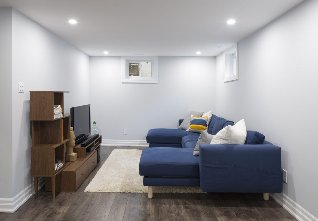
Turn your basement into the place your kids and their friends want to hang out in. This could include an entertainment system, home theatre, video games, darts, a pool table, and other games… more on this later.
Increase the Value of Your Home
These days, a finished basement will boost the resale value and curb appeal of your home. On average, a finished basement provides a 70% payback, making it one of the wisest home renovation projects in terms of boosting home value.
A finished basement can be included in your home’s official square footage measurements. And even if it’s not included, buyers will see the finished basement as valuable extra living space.
A finished basement will also improve the likelihood of selling your home. Many homebuyers prefer homes with finished basements, and unfinished basements are often deal-breakers.
Ideas for Your Basement Reno Project
How you renovate your basement will depend on its future uses. Some common basement design and renovation ideas include:
- A wide, open-concept space for multiple uses—rec room, family room, kids’ room, or gym;
- A kitchenette and bar area;
- Income, such as Airbnb or long-term rentals;
- Extra space for a guest suite and/or a home office; and
- A sound-proof room for a home theatre.
Create a Home Theatre
A finished basement is a perfect space for your dream home theatre. You can add comfortable reclining chairs, a surround sound system, and (of course) a massive TV or a projector and screen.
A home theatre is a great option if your family loves nights in watching favourite films together, or if you’re a film buff keen on watching your favourites without distraction. If you’re not keen on a full home theatre, consider creating a multi-purpose rec room, perfect for catching the big game with a cozy bar close on hand.
Create a Quiet Home Office
If you work from home, you likely get interrupted by both loved ones and noise from outside. Thankfully, basement finishing gives you an opportunity to create a quiet, soundproofed office to get your work done in.
What’s more, a home office offers an opportunity to create a bit of balance and distance between your job and your home life.
You’re still under the same roof, but having a dedicated space for work can do wonders when you’re looking to maintain distraction-free productivity.
Bring Your Gym Home
Driving to the gym before or after work is often one of the last things people want to do every day. But if you have a home gym in your basement, you might find it easier to stay motivated and get your workouts in.
A home gym offers convenience and privacy while saving you plenty of valuable time and money. You won’t have to drive in traffic, pay for a gym membership, or wait to use gym equipment during peak gym hours.
What to Consider When Designing Your Space
Keeping it Dry & Comfortable
Basements are often cool, and old, unfinished basements have an unfortunate tendency towards dampness, especially during spring thaws. Basement renos are a great opportunity to address these common complaints and issues while improving on your existing space. Our team will always keep an eye out and inform you of any cracks in the foundation or signs of water damage in your basement.
Water issues may be caused by issues in the foundation, or you might just need better grading around your home to prevent water buildup and drainage issues. Installing vapour barriers in the walls and floors before framing and finishing these surfaces helps prevent moisture from getting in.
Local Building Codes
Check with your local municipality to see if you need any building permits and to help guide your basement renovation.
Building codes dictate the requirements needed for a safe building. These include the types of insulation, windows, and egress—paths to exits, especially in case of fires.
If you need plumbing and electrical work in your basement, you will also need a professional inspection.
Ceilings
The ideal height of a basement ceiling is no less than 7 feet, 6 inches, but if you’ve got the room for a higher basement ceiling, why not go for it? Consider the type of ceiling you want and how much space it will leave once finished.
Drop or suspended ceilings conceal venting, plumbing, and electrical connections while providing ease of access through removable tiles. These ceilings will reduce the amount of overhead space, and aren’t ideal for a home theatre set up. Look at what you want to do with the space before making a final decision on the ceiling.
Lighting
Since basements usually don’t have as many windows as other levels in a home, the amount of natural light is limited. This can make basements seem dark and gloomy.
But with enough artificial light, basements can feel warm and welcoming. Consider recessed lighting in the basement ceiling since it won’t take up overhead space.
Your basement renovation plans will depend on how you want to use your new basement, now and in the future. While it’s worthwhile to keep an eye on the budget, building codes, and practicality, don’t lose sight of your vision! Working with Sunter Homes, you can create the space you’ve always dreamed of and make it a reality.
Bringing Luxury to Any Bathroom
Bathroom Renovation Ideas to Transform Any Bathroom into a Luxurious Space
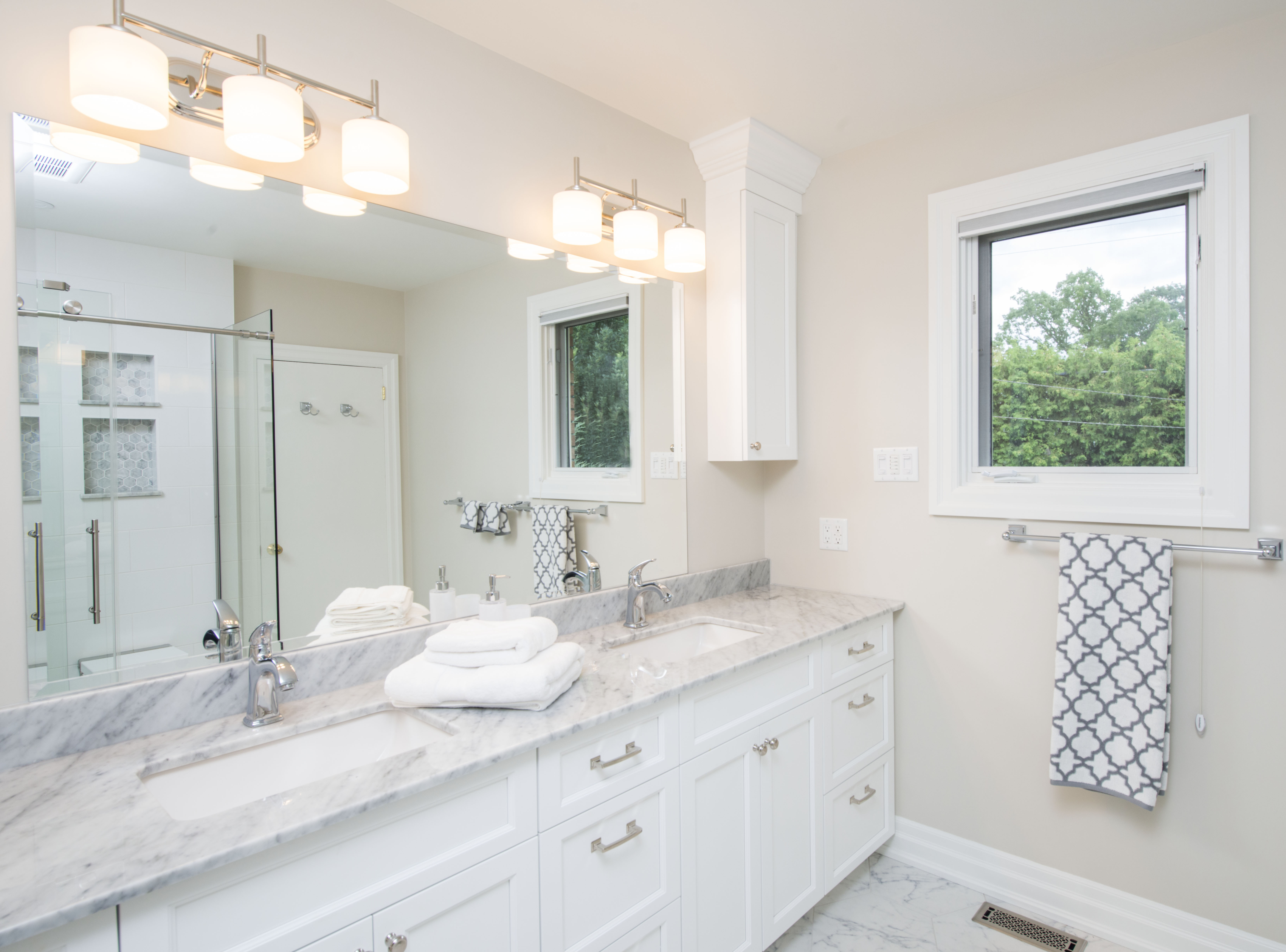
Bringing a touch of luxury into your bathroom renovations can be a daunting order.
Luxury, after all, instantly brings images of eye-catching fixtures and high-end fittings to mind.
If you’re a bit put off by flash pieces, you’ll probably breathe a sigh of relief that luxury bathroom renovations aren’t all about the bling. Rather than filling your space with showy pieces, bathroom luxury can be found in the simple details and pieces that create a sense of tranquil serenity.
It’s these details that can make even the smallest bathroom feel luxurious and comfortable.
No matter the size of your space, it’s the little things that count, helping pull a design together or adding features so intuitive you never have to think about them.
Large bathrooms can be made to feel comfortably intimate, and small ones can feel more spacious. Even the smallest details can improve the overall look and feel of a small bathroom.
If you’re looking for inspiration, you’ve come to the right place. We’ve put together some of the best bathroom ideas for a luxurious look and feel.
What Should You Include in A Luxury Bathroom Renovation?
This is the big question! Answering it means considering a few key factors:
- What is your budget?
- Is this your forever home?
- What look and feel do you want?
Obviously, the budget determines a lot of what is possible when working with renovation experts. Despite that, however, they’re still able to make recommendations and alternatives to help save where possible.
That said, at Sunter Homes, we highly recommend using high-quality materials. These materials, with expert installation, will help keep maintenance to a minimum, ensuring beauty built to last.
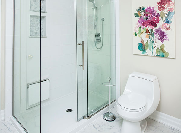
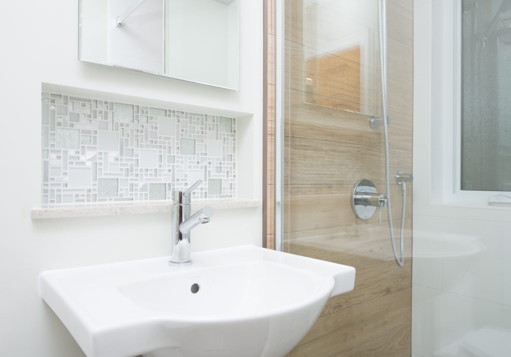
We’ve been asked to create unique tiling features, including shelving, niches, and benches, in a variety of bathroom renovations. Some clients have also requested unique features within their bathrooms, including a wood-imitation tile feature for natural aesthetics in a shower.
Shower windows with privacy glass are a popular option, too. You can easily expand a small space with some careful window placement, letting more natural light into the space. It’s also not uncommon to see skylight installations in washrooms to provide additional natural light, as well as a connection to the outdoors.
Custom tilework and a continuous seal help ensure these windows work perfectly while looking great. Privacy glass offers a must-have finishing touch.
Expanding the space of your bathroom can open up possibilities, too.
Luxury features, such as a larger tub, separate shower, or water closet are entirely possible. You can expand the size of your vanity, upgrading the materials along the way.
Another popular feature is heated flooring, perfect for stepping out of a warm shower on a cool fall or winter morning.
Other Considerations
Shower & Bath Upgrades
Luxury bathrooms provide spa-like relaxation and bathing with features such as:
- A glass surround shower with ceramic tile walls and upgraded fixtures, such as rainfall showerheads, hand showerheads, and multiple jets. Replacing a standard showerhead with a shower system is one of the easiest ways to add luxury to a shower.
- A walkthrough two-person shower. These showers have multiple shower heads so each person can control their water temperature separately.
- A Jacuzzi tub or a chromotherapy tub and shower that use coloured LED lights for relaxing colour therapy.
Extra Luxury Features
Additional features to improve the look and function of your bathroom include:
- Ceramic tiles.
- Heated floors and towel bars. Heated floors remove the need for heaters that take up valuable space in bathrooms.
- Spot lighting and waterproof shower lighting.
- A humidity-control exhaust fan;
- A built-in wall cabinet.
- Built-in waterproof Bluetooth speakers.
- Fine art.
- Stained glass windows.
For the ultimate luxury bathroom, consider using high-end materials such as marble, granite, travertine tile, crystal, and gold-plated finishes.
What Is the Best Colour to Paint A Bathroom?
While bathroom colours are, at the end of the day, a matter of personal preferences, there are a few rules of thumb to keep in mind.
If you’re looking to make a small bathroom look bigger, choose white for the walls. White recedes and reflects light, creating an open, expansive feeling.
What’s more, paired with features in the same colour, white offers a seamless, clean look that’s hard to beat.
Soft grays, warm beiges, and gentle blues are also safe bets. If you’re going for colours other than white, then you should consider using a tone-on-tone palette to draw the eye.
There’s no rule against bolder colours, but if you’re looking for luxurious tranquillity, these options are your best bet.
How Tilework Can Make or Break a Bathroom
Tilework, backsplash, and grouting… they all demand a keen eye and attention to detail. More than any other feature, tilework that looks or feels off can be hard to ignore in an otherwise beautiful, cohesive space.
There’s a fine line to walk with it; too complex, and you risk creating a cluttered feel. Too large, and you risk overpowering other elements.
We typically use smaller tiles for fine detail work, maintaining continuous lines throughout with impeccable installation. This is perfect for a shower niche or custom inset tile shelving that rests in the wall.
Your floor tiles should be larger, though. Large tiles have fewer grout lines, helping expand the room.
Placing floor tile patterns diagonally on a floor will also trick the eye, making any space look a bit bigger.
How Do You Make A Small Bathroom Look Bigger?
This is a big question when it comes to bathroom renovations. Making the most of a small space doesn’t take much other than some careful planning and creativity.
You might consider some of the following small bathroom reno ideas:
Outward-Opening Doors
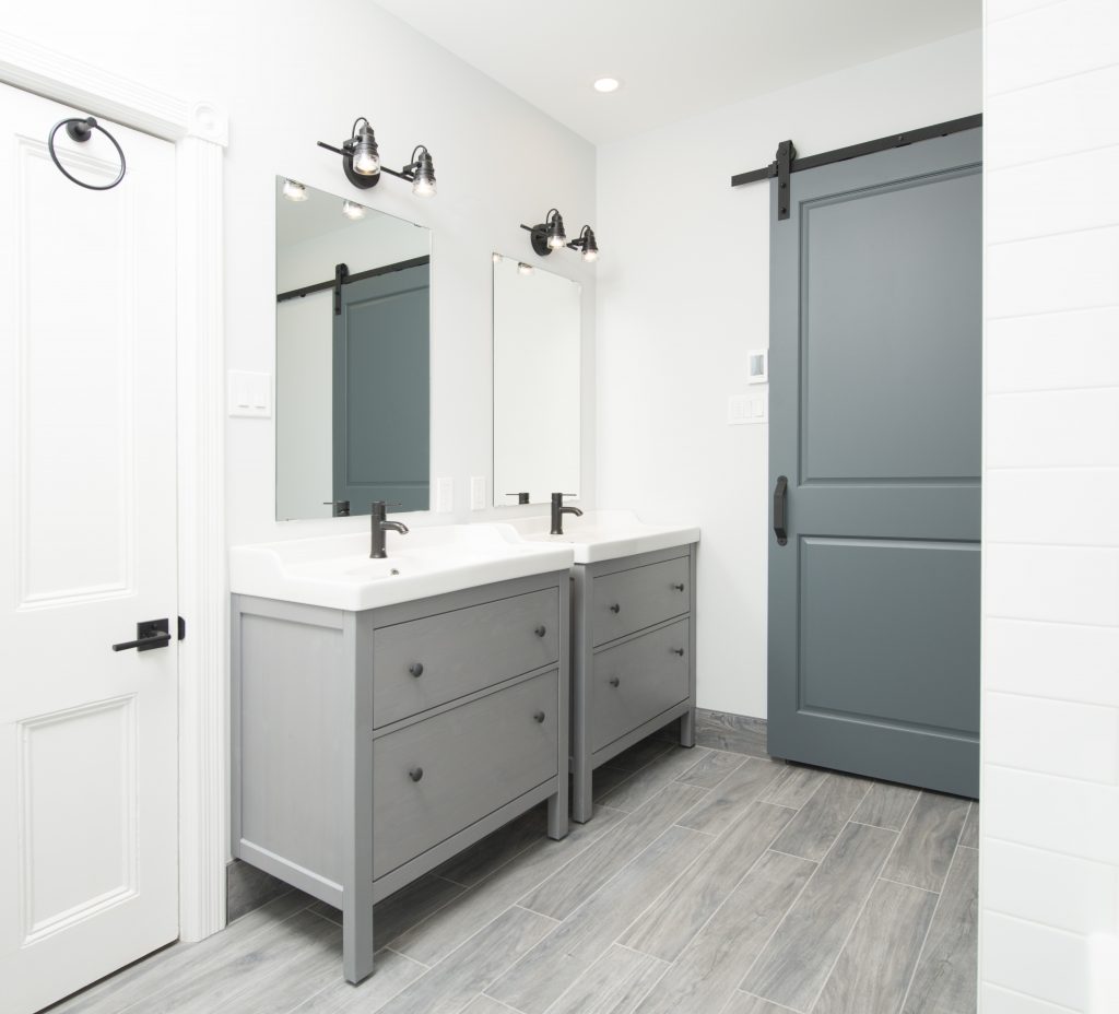
To preserve space in your bathroom, opt for a door that opens out from the bathroom instead of into your bathroom. Pocket doors and sliding barn-style doors are great options to help save a bit of space, offering great aesthetics that can easily be customized to your taste.
Floating Vanities
The open space under a floating vanity makes a small room feel and look more open. A floating vanity gives you plenty of storage space for your bathroom essentials and provides more floor space so you don’t feel cramped.
Choose a Smaller Vanity
On the other hand, if you don’t need the extra storage space, consider a smaller vanity that won’t take up the entire width of a wall.
The open space on both sides of a small vanity will make the space feel roomier. What’s more, you’ll have more space to move around from your toilet and your shower.
Large Mirrors
A large mirror above your sink can double the size of your space visually. Consider a large framed mirror or a wall-to-wall mirror to open up your bathroom.
Bright Lighting
Bright lighting makes any space appear larger. Since bathrooms tend to have minimal natural light, it’s important to have good lighting.
If you have a window in your bathroom, replace any curtains or blinds with privacy film. This will give you the privacy you need while allowing natural light in.
You should also consider multiple light sources, such as a grid of ceiling lights paired with an edge-lighted mirror or sconces. If more lighting can't be added, use a ceiling light fixture that has multiple bulbs so the light will brighten the room in all directions.
A Glass-Paneled Shower
Replacing a shower curtain with a glass panel or a glass door will open up your bathroom, revealing the entire square footage of the room. If you want some privacy, opt for frosted or tinted glass that will still allow plenty of light to pass through.
A Shower Stall
If you’re not a bath person, you can remove the bathtub altogether and install a shower stall. Bathtubs are bulky and take up a lot of space. So by removing the tub, you will have more open floor space in your bathroom.
But if you want to keep your bath, consider a bathtub/shower combo that is strategically placed so it won’t overwhelm the rest of your bathroom space.
Inset Shelving
You can use empty wall cavity space to create inset storage. Whether you want open shelving or an inset cabinet, this storage won’t protrude into the room, so your bathroom will feel more open.
Emphasize the Longest Wall
Add a long element to the longest wall of your bathroom so you can draw the eye to the longest point. This could be a shelf, a rail, a band of tile, or even a stripe of paint.
Emphasize Width
For long, narrow bathrooms, visually emphasize the width instead of the length. You can visually push the walls apart with long floor tiles and a band of accent tiles on the wall or in the shower that go along the width of the room.
Bathroom renovations can easily add a touch of luxury to your home, creating a tranquil, spacious, and serene room you can escape from the day and recharge. If you’re not sure where to start or have a vision you want to bring to life, contact Sunter Homes today—we’ll help you make the most of your space.
Renovating and Designing a Kitchen with Character
We Walk You Through a Stunning Glebe Kitchen Renovation, From Start to Finish
Kitchen renovations frequently work to add functionality to the heart of the home, but how do you make it feel truly yours? There are any number of kitchen styles to catch the eye, after all. How do you find one that reflects your taste and vision?
You create it yourself, with help from experienced construction and renovation experts who take your style and vision and bring it into the real world.
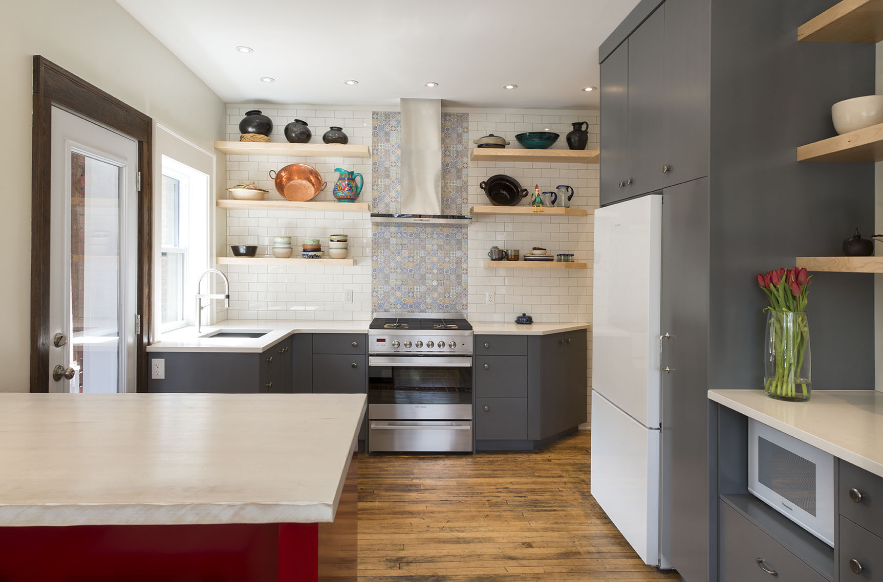
At Sunter Homes, we’re always thrilled when our clients come to us with a clear vision in mind for their space. When our client approached us to renovate this kitchen in their Glebe home, they wanted to incorporate a Mexican theme while updating the space’s open concept.
Pair that with the possibilities of the home’s original 19th-century details, and we couldn’t help but get excited about this project.
“This was a very cool and exciting project for us,” said Jon Brandt, Sunter Homes’ Lead Foreman. “It was different from most jobs that we’ve done with regards to the kitchen cabinetry layout and even the overall storage space.”
Let’s take a closer look at this stunning Glebe kitchen renovation and how we brought it to life.
Style, Storage, and Function
Despite the kitchen’s original open concept, there wasn’t much practicality in its layout.
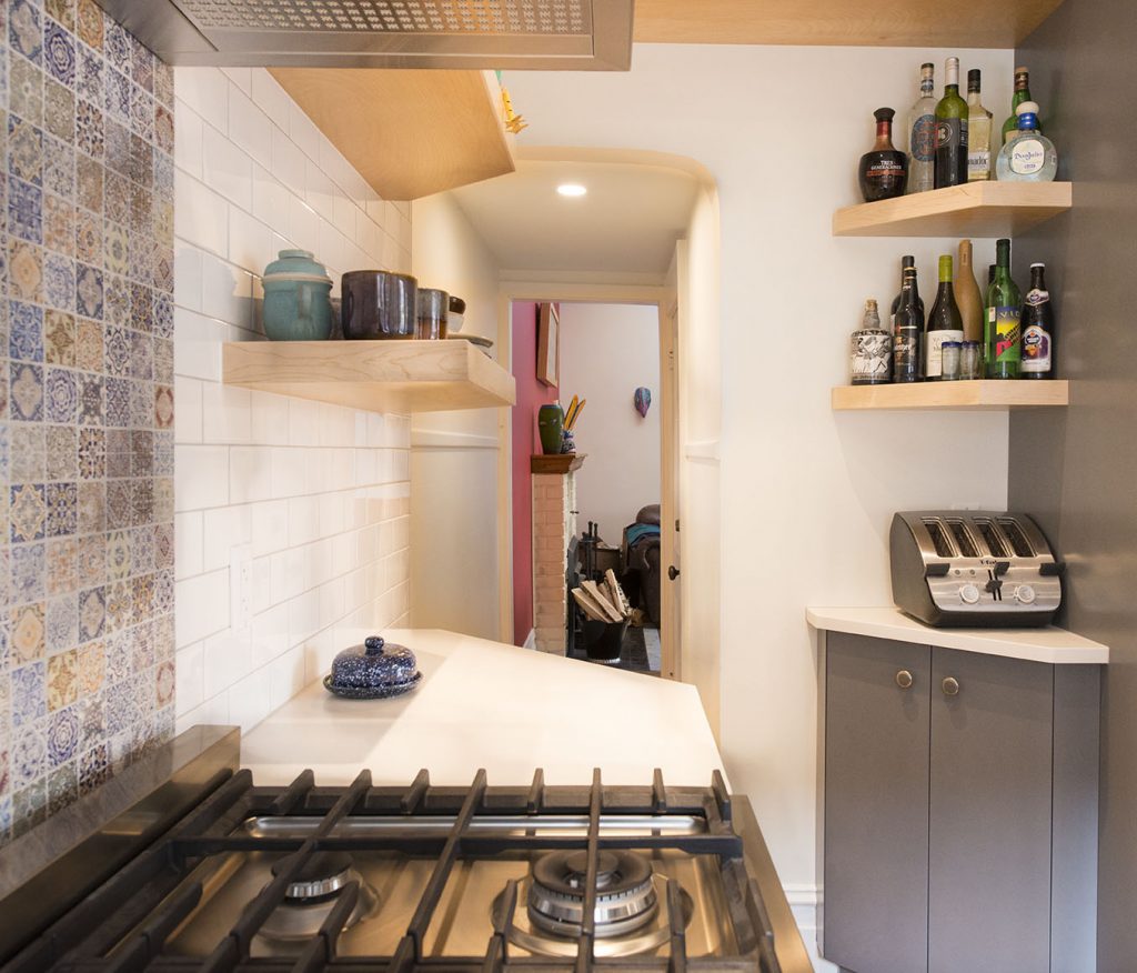
The range once sat against the wall where the pantry now rests, tucked tightly next to the arched entrance at the back of the kitchen. That wall, backing onto a beautifully tiled hall, was broken up by a second doorway.
It was very important to the homeowner to maintain that back entrance and its second-storey staircase. The already-tight arched entrance got some relief with the installation of angled base cabinets, and we were able to maintain the amount of storage with continuous shelving over the entrance.
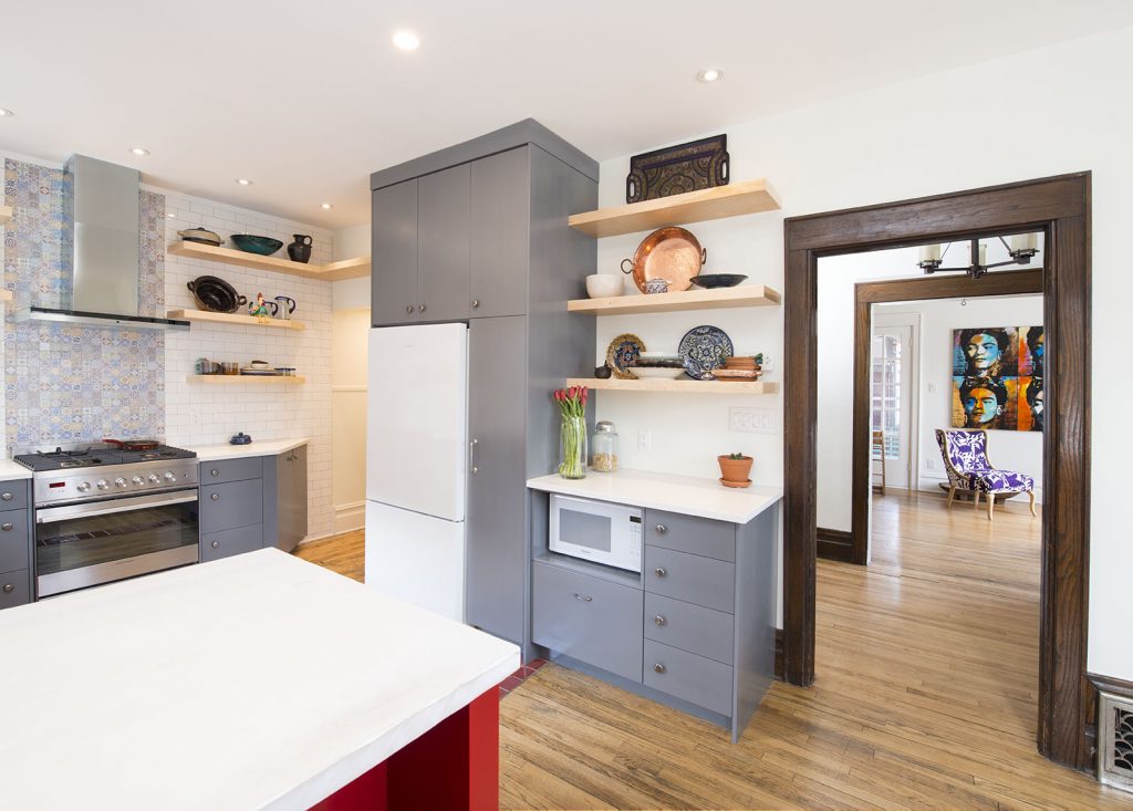
We knew that closing that second doorway would help define the kitchen more and create an opportunity to add more storage and counter space. This also gave us an opportunity to find a new home for the range, which we relocated to its current space with a beautiful new vent hood.
By moving the range and sealing off the doorway, this created a perfect space for a pull-out pantry and open shelving storage to maintain the Mexican theme. We also found a new home for the fridge, tucking in alongside the pantry.
“Typically, we’d be using upper cabinets for most of the storage,” said Jon of the storage updates.
“In this project, we used all open shelving across one of the main walls. Basically, what we did was put a piece of solid backer for the shelves across the entire back of the kitchen. We then used ¾-inch plywood tiled across the kitchen’s back, and we put in cleats to receive what would look like floating shelves.”
This plywood backing was affixed to the wall, furred to ensure it was plumb. This allowed for a deeper stud cavity, which was then insulated using 2-pound closed cell spray foam.
The finished shelving is, simply put, stunning.
“It really added to the overall aesthetics of the kitchen,” added Jon.
Unique Details, Big and Small
We always find that the details make or break a space, and there’s a particular sort of satisfaction at seeing all these details come together to create a truly beautiful space.
One key detail in this Glebe kitchen renovation? The beautifully distressed flooring.
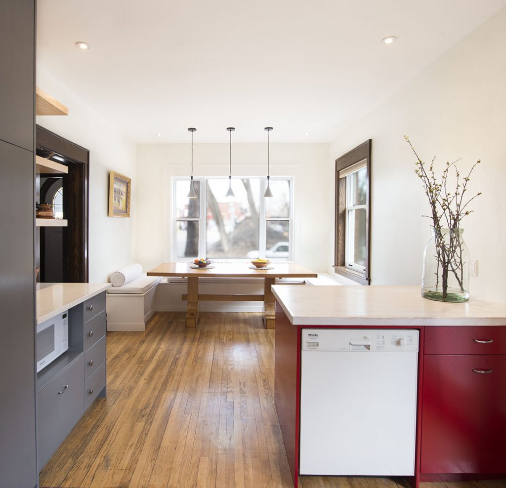
“All the floor was pre-existing,” said Jon. “The client wanted to maintain that distressed look across the hardwood floor, but we did have patches to do from where the old cabinets lay, as well as patches from the new layout.”
Quite a bit of darkening had taken place on the existing floors over the years, so it was up to us to match that distressed look on these patches.
“The new oak that we put in, we actually used a blowtorch to give it that distressed, weathered look,” said Jon. “We were able to stain and finish it from there, which matched up with the rest of the flooring quite nicely.”
The rounded archway at the kitchen’s rear also presented an opportunity to tie a few beautiful details together.
“Moving into the hallway, it has a kind of subway look with the tiling. We had to tie in our wall tiles to this archway,” commented Jon. “It was a very neat look, moving from this vintage-looking, rounded-over, old-style archway to a Mexican mosaic back wall.”
That mosaic back wall is perfectly complemented by the white subway tile that frames it and a specially-made butcher block countertop that the owners distressed using chains, screws, and nails. The exposed vent hood, too, draws attention to the inset mosaic tile.
Stunning Colours to Match Theme
Colours were important, too.
“The client with very rich colours for their cabinetry, as well as a very nice red peninsula coming off the wall with that distressed butcher block,” said Jon. “They used rich grey colours for the lowers in the kitchen.”
The clean white look of the fridge provides balance with the rich dark-grey pantry.
Keeping in line with the existing trim, we included a three-part trim assembly to match up with the early 1900s window casing.
“We brought in a lot of new, modern cabinetry, but all keeping in with the Mexican theme, which turned out very nicely, and really catches the eye with all that open shelving.”
Final Touches and Thoughts
In addition to the design and layout updates, we also replaced four old windows, one in the dining room two in the kitchen’s eating area, and one directly in the kitchen space proper, above the sink.
These windows offer plenty of natural light in what once felt like a very tight space, adding to the kitchen’s open feeling and appearance. From the big-picture layout changes to the small details and design touches, this project was a fantastic opportunity to pair our passion for exceptional quality and craftsmanship with a unique and eye-catching design.
“The client is quite happy with everything we laid out and discussed throughout the project,” shared Jon. “We came up with a few different solutions for transitions that had to be accomplished.”
It’s not every day that we get to use such an eclectic and unique design in a space, blending a mix of aesthetics that are eye-catching in their own right. We love seizing every opportunity we get to find the true potential in a space or home.
The results can be transformative, and we love the feeling of walking into a finished space almost as much as our clients do. Better still, in a home with so much character, there’s something great about being the team to get the job done and provide those finishing touches that tie everything together.
“You have a mix of the old 1900s trim with new windows, and this Mexican-themed open-concept space, which really pulled together everything they were doing with the floor,” commented Jon. “It turned out to be quite a lovely kitchen.”
We couldn’t agree more.
Designing Your Dream Kitchen
Common (And Uncommon) Considerations to Make the Most of Your Space When it’s Time to Renovate
Kitchens are truly the heart of a home. They get plenty of non-cooking traffic and use from the whole family, after all, so making the most of this space is a priority in any kitchen design.
Do you find yourself frustrated by a lack of storage space? Is counter space at a premium? Maybe your sink and appliances are leaving a lot to be desired.
Thankfully, fresh designs can alleviate these concerns, freeing up space to let you move freely and comfortably through your kitchen. A new kitchen layout can create a space for meal prep, a breakfast nook, and even a place for you to entertain while you cook.
Making the most of your kitchen takes careful planning and consideration. Consider these design options and ideas when renovating your kitchen to help bring your vision to life and make your dream kitchen a reality!
The Heart of The Kitchen: Why Work Flow is Important
Kitchen design focuses on making the kitchen more comfortable and convenient, all while adding welcome aesthetic updates. Central to this is the concept of “work flow,” or how smoothly you can move from one work zone in a kitchen to another while preparing a meal.
There are three main work zones in a kitchen that influence kitchen design:
- A cooking zone, which includes the stovetop, oven, and microwave.
- A washing zone, which includes the sink and dishwasher.
- The storage zone, which includes the refrigerator, freezer, pantry, and dry food cupboards.
The space between these three zones and how you maneuver through them contribute to overall workflow.
Depending on your kitchen’s current design and layout, you may be able to make some improvements in efficiency.
Ideally, your tools and workspaces should always be within easy reach, which brings us to the work triangle.
The Work Triangle
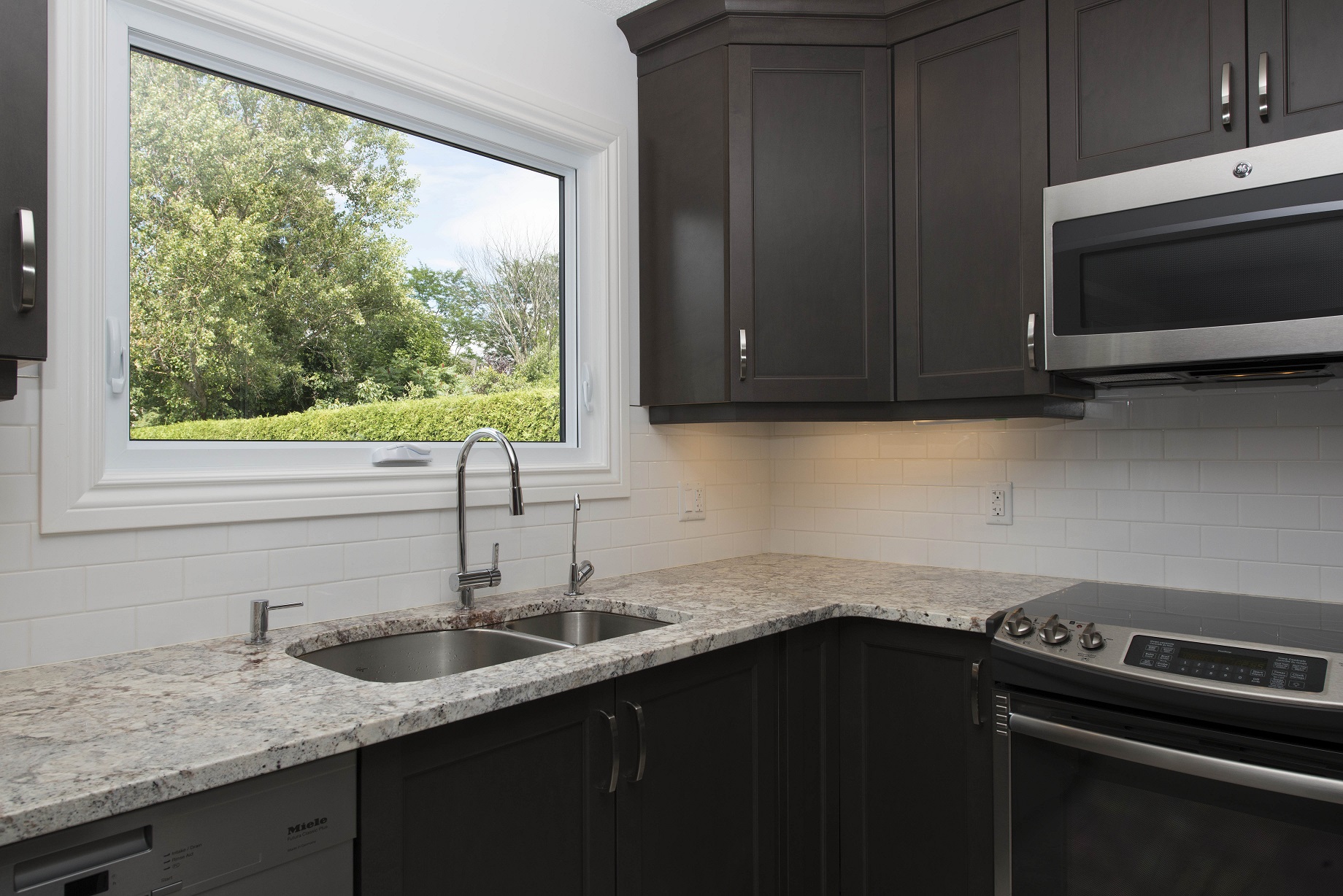
Optimal kitchen workflow uses the sink, stove, and fridge as three points on a triangle, known as the work triangle, to help plan and design a kitchen layout.
Of course, placing these three points to ensure an ideal layout is easier said than done; too far between any point, and you’ll feel like you’re dashing from one spot to the next constantly. Too close, and you’re left feeling cramped and crowded.
As a general kitchen design rule of thumb, all lengths between points on the triangle should be between 4 and 9 feet, and the total length between each point should be between 14 and 26 feet.
Looking to make the most of your kitchen’s work triangle? Here are a few tips to keep in mind:
- Place your cooking zone next to your washing zone. You don’t want to cross your kitchen with heavy pots of boiling water when you need to drain pasta.
- Keep counter space next to your cooking zone so you can prep, cook, and take food from the oven to place on the counter.
- Your fridge should be within reach of your washing zone to make food washing and prepping easier.
- Counter space near your storage zone will make unpacking groceries a lot easier.
Layout Options
What layout options are you considering for your new kitchen design?
While space and intended use dictate a few hard limits on your kitchen, redesign and renovation present a fantastic opportunity to find a layout that works for your needs.
There are plenty of choices available to choose from. Let’s take a closer look at some of the most common layout options:
Single-Line Kitchens, Perfect for Small Spaces
If you don’t have enough space for a work triangle, a work line might suit your needs just as well. The single-line kitchen is exactly what it sounds like: a single line of kitchen space against a wall.
While they might seem small, they still offer a fair amount of flexibility, and it’s easy to maximize your space to make an optimal work line. For example, you can place counter space between a stove, sink, and fridge with cabinets above and below.
Single-Line Kitchens with Islands
Take the concept of the single-line kitchen and add an island facing it to add a bit of flexibility to your kitchen. An island provides extra storage and counter space, and even a spot for dining, all without taking up too much valuable real estate in your kitchen and your home.
Parallel (Galley) Kitchens
Think of these kitchens as a hallway with prep, cooking, and storage on either side – essentially, two single-line kitchens facing each other. Parallel kitchens are fantastic for small spaces, and provide ample counter and storage space.
For example, a parallel kitchen may feature cooking and washing zones on one side, with counter and storage space to spare. The facing side is home to the fridge plus extra storage and counter space.
U- and L-Shaped Kitchens
Space permitting, these kitchen layouts are ideal if you want to add an island or a small dining table to your space. As the name suggests, one takes the form of an L shape, with two work zones on one side and one work zone perpendicular to the other zones.
U-shaped kitchen designs work for larger spaces. The U shape makes each kitchen work zone within reach and provides ample storage space.
Avoid These Common Issues with Modern Kitchen Design
Poor Sink Placement
Due to the location of a home’s pipes, the sink might be located in an inconvenient place in the kitchen. This can disrupt a comfortable kitchen work flow and obstruct the work triangle. The Sunter Homes team can help you relocate your sink to a better location.
Wasted Storage Space
Kitchens often waste space that could go towards storage. But with careful planning, you can make the most of your kitchen space so you have enough storage for food, dishes, appliances, and gadgets.
For example, make sure you have cabinets filling the space above your fridge. And install shelves on the back of your bottom cabinets to store more items.
Not Enough Counter Space
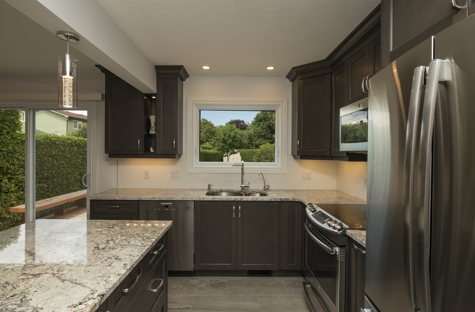
Most kitchen activities need counter space, yet many kitchens do not have enough of it. Consider adding an island to an L-shaped kitchen for more counter (and storage) space. When adding an island, make sure it’s not too close to appliances nor too far from them.
Designing A Kitchen Around Your Needs
Whether you’re a single person who loves to cook and entertain or are feeding a family of six, it’s important to design a kitchen that reflects your lifestyle and needs. Think about features you’d like to add and ways to improve your kitchen workflow.
For Chefs
Many chefs enjoy cooking and entertaining guests in their kitchen, so adding an island with ample counter space, cooking space, and even a sink can help chefs enjoy their passions at home.
As such, an L-shaped kitchen with an island, possibly looking out onto a living room, gives chefs an opportunity to entertain while they cook at home.
While most chefs are likely used to working in utilitarian spaces, a custom home kitchen is an opportunity to cook in true comfort. Consider durable yet stylish counter materials that can handle frequent use, chopping, and heat, and eye-catching backsplashes that easily be cleaned.
Another option to consider: invisible hardware on drawers and cabinet doors to prevent pokes and pulls. This will prevent your clothes from catching on hardware while you move around the kitchen.
Families
For families, kitchens see a lot of foot traffic, especially if they are located near an entrance to the home. Consider a layout that reduces traffic in your kitchen for a safe and comfortable cooking experience.
Create a space for coats, boots, mail, etc. to use before entering the kitchen, and make sure the fridge and oven doors don’t obstruct your kitchen pathways when opened.
No matter what you’re looking for in a kitchen, working with experienced professionals can help you bring your dream designs into the world. Don’t hesitate to get in touch today to learn more about creating a new kitchen that works for you – and looks fantastic, too.
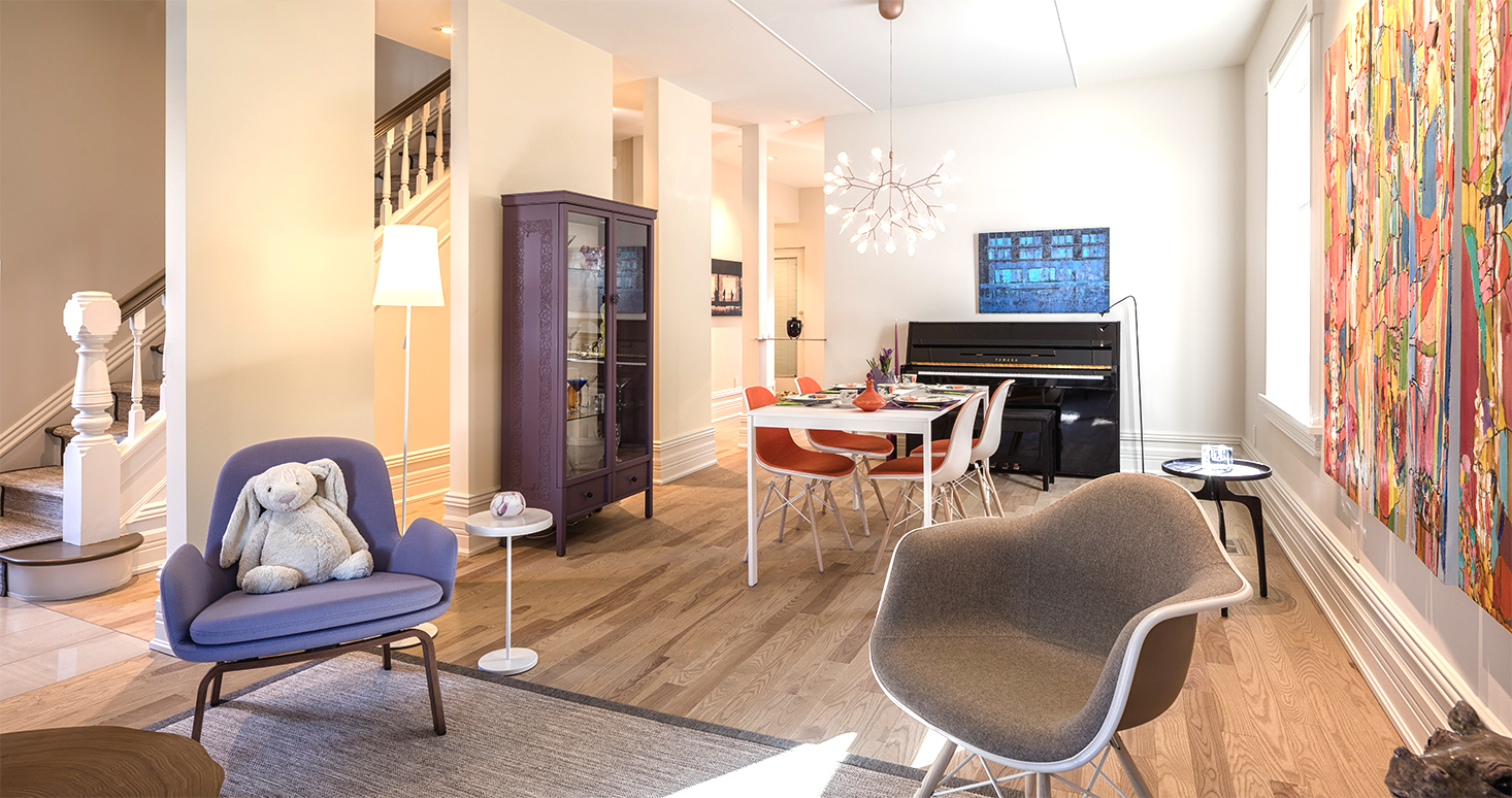
Dramatic Glebe Renewal
Have you wondered how to transform a tired or run-down fixer-upper into something elegant and stunning? This clean modern renovation to a classic Ottawa home in the Glebe made the cover page of Our Homes Ottawa Magazine! You can read our story on page 46.
